



































Understanding Color Grading in Photography for Stunning Visuals
Learn how color grading in photography enhances mood, tone, and storytelling. Discover techniques, tools, and tips to create visually compelling and professional images.

Understanding Color Grading in Photography
Introduction
Color grading is a powerful technique in photography that enhances the mood, tone, and overall visual appeal of an image. While many people confuse it with basic photo editing, color grading goes beyond simple adjustments; it is about creating a consistent and intentional look that tells a story and evokes emotion.
What is Color Grading?
Color grading is the process of adjusting and enhancing the colors in an image to achieve a specific style or atmosphere. Unlike basic color correction, which focuses on fixing exposure and white balance, color grading is more creative and stylistic.
For example, a warm color grade can make an image feel inviting and nostalgic, while cooler tones can create a calm or dramatic effect.
Why Color Grading Matters
Color grading plays a key role in how an image is perceived. It helps:
-
Set the mood and emotion of a photograph
-
Create a consistent visual identity
-
Enhance storytelling
-
Make images more visually appealing and professional
For brands and content creators, consistent color grading also strengthens brand recognition across platforms.
Key Elements of Color Grading
-
White Balance
This controls the warmth or coolness of an image. Adjusting white balance ensures colors look natural or intentionally stylized. -
Contrast
Contrast defines the difference between light and dark areas. Increasing contrast can make images more dynamic, while lower contrast creates a softer look. -
Saturation and Vibrance
These control the intensity of colors. Saturation affects all colors equally, while vibrance targets less saturated tones, making adjustments more balanced. -
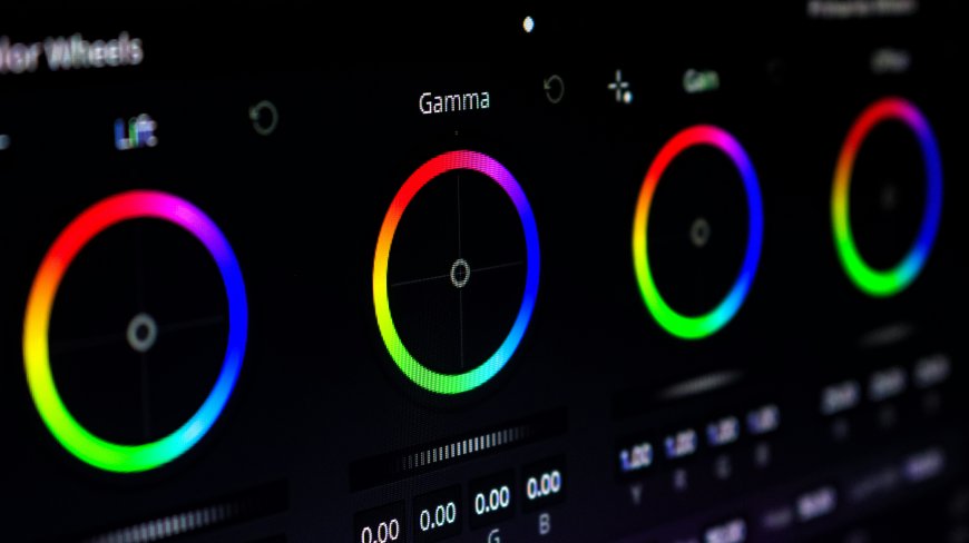
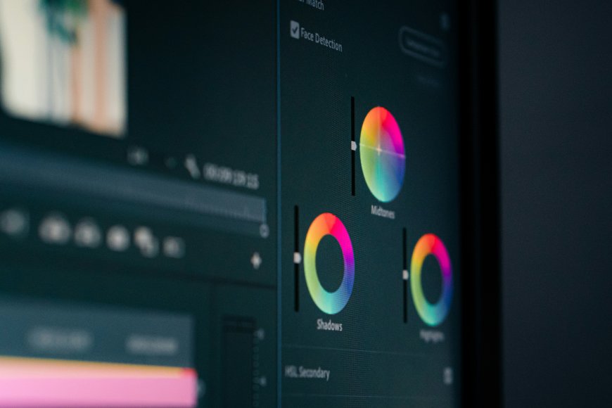
Color Tones (Shadows, Midtones, Highlights)
Color grading often involves adding different tones to various parts of an image. For instance, adding warm tones to highlights and cool tones to shadows creates a cinematic effect. -
Hue Adjustment
Hue changes the actual color of elements in the image, allowing photographers to fine-tune specific colors for a more polished result.
Popular Color Grading Styles
-
Warm and Natural: Common in lifestyle and portrait photography
-
Cool and Moody: Often used in cinematic and artistic shots
-
High Contrast: Creates bold and dramatic visuals
-
Muted Tones: Softens colors for a minimalist, modern look
Tools for Color Grading
Photographers use various tools to achieve color grading, including:
-
Adobe Lightroom
-
Adobe Photoshop
-
Capture One
-
Mobile editing apps like Snapseed and Lightroom Mobile
These tools provide advanced controls for precise adjustments and creative freedom.
Tips for Effective Color Grading
-
Start with proper exposure and color correction before grading
-
Avoid over-saturating your images
-
Maintain consistency across your photos
-
Use presets carefully and customize them to fit your style
-
Always consider the mood you want to convey
Conclusion
Color grading is an essential skill that transforms ordinary photos into visually compelling images. By understanding how colors influence mood and perception, photographers can create impactful visuals that stand out. With practice and the right tools, mastering color grading can significantly elevate the quality and storytelling of your photography.
What's Your Reaction?
 Like
0
Like
0
 Dislike
0
Dislike
0
 Love
0
Love
0
 Funny
0
Funny
0
 Angry
0
Angry
0
 Sad
0
Sad
0
 Wow
0
Wow
0